Class meetings in fall 2020

If you had already enrolled in the course by July 9, 2020, you were sent an email (on July 9) at your UFL email address. Details about how the course will be conducted in fall 2020 are in that email. There is also a link for you to sign up for the course Slack.

Course work will be done in Canvas. Videos are on YouTube. The class will meet in Zoom synchronously once a week, with other blocks of time set aside for lab hours.

Please email me at my UFL address if you need me to resend the email to you.

Using max-width on an IMG (or any other element)

This refers to a question asked near the end of class today. It turns out max-width (for images) is covered in Robbins chapter 7, but in the latter part of the chapter that you were not assigned to read. I realize now that this was related to changes in the new edition of the book, because Robbins details how to use srcset and multiple versions of an image file, and I DO NOT want you to bother with all that, because in professional settings the multiple versions are created by automated software on the organization’s web server.

However, max-width is easy to use and very common, and it will likely help you in Assignment 4 (your second CSS assignment). It’s used for more than just images.

One of the easiest ways to use it is to make sure your image can automatically shrink in size if necessary.

img {
   max-width: 100%;
}

That would affect EVERY image on the page. Just add it to your CSS. If the image is inside a DIV or other element that changes in size on a smaller device, the image width will always be NO WIDER than the containing element. The image will not overflow its containing element.

Another common (and nice!) use of max-width is to constrain the width of an element holding text. On wide screens such as desktop computers, you don’t want the lines of paragraph text to be the whole width of that giant monitor. You want it to look more like a column. So you can apply max-width with rem or px to constrain the containing element, such as article. For example:

article {
   max-width: 700px;
}

Why 700px and not some other number? Well, maybe it’s because that width looks great with your images, depending on the width of the images — and whether they are inside the article or outside of it. In other words, there is no “magic number” of pixels or rems that is “best.” It depends on your content, your page design, your font size, etc.

Making sure your paragraph lines of text do not get too long is actually something that helps make your content easier to read. There’s something called optimal line length, and it affects the readability of your text.

Using max-width this way on an element containing text also allows it to shrink gracefully on smaller screens. If you use just width, it will not shrink. Note that this shrinking I’m referring to is completely separate from flex — not even using flex at all, max-width will allow elements to shrink.

Bootstrap 4 Help

Updated Oct. 30, 2020

If you’re tempted to add your own styles to a page you are making with Bootstrap CSS — stop and consult these pages FIRST. It’s so much better to work with styles that Bootstrap has already given us.

  • Spacing — read everything under Notation to add margin or padding to any element
  • Textalignments, bold, italics, etc.
  • Typography — make headings much larger, style pullout quotes and source attributions, and more — LOTS here
  • Images — aligning them, centering, making responsive
  • Buttons — make them bigger, smaller, full-width, etc.
  • Colors — add the Bootstrap colors with these special styles
  • Alerts — even more colors (lighter colors)
  • Forms — all the styles for form controls, labels, etc.

Collapse is a Bootstrap replacement for jQuery hide/show.

Remember, all the things can be found in links on the left side of the Bootstrap Documentation pages.

IMPORTANT: The special layouts and devices such as the Carousel can be found on the Examples page. The code for those is in the GitHub repo on THAT PAGE — click the “Download source code” button and download the zipped repo file. Find the files you need by opening, in order, these folders:

  1. site
  2. docs
  3. 4.5
  4. examples

Happy Bootstrapping!

Learning jQuery


When jQuery was new (back around 2006–10), it was mighty hard to use JavaScript to rewrite the DOM and get it working consistently in every browser. The jQuery library solved a ton of problems because, under the hood, it had JavaScript functions that took into account almost every bad browser thing that could ruin your day. By using jQuery objects and methods, you could rest easy and be confident that your interactive things would work as intended for just about everybody.

JavaScript has been improved since then, and ES6 JavaScript is far better than all the versions before. Browsers are better now too. Some people question whether we need jQuery at all anymore.

Well, 89.62 percent of the top 10,000 U.S. websites (“top” meaning most traffic) use jQuery today, according to BuiltWith. So you just can’t ignore it.

jQuery Resources

jQuery Cheat Sheet

To specify something, anything, in your HTML:

  • $('.blue') — everything that has a class of “blue”
  • $('#chocolate') — anything with the id “chocolate”
  • $('h2') — every h2 element

When you’ve specified something that way, you’ve created a jQuery object, which automatically has a ton of possible methods, as well as properties.

To apply a jQuery method, such as .hide(), to a jQuery object, such as $('.blue'):

$('.blue').hide();

That hides everything with a class of “blue.” Look up the methods using one of the resources linked above.

Event handlers — you’ll learn about these in any jQuery tutorial. Events are actions initiated by the user, such as scrolling, clicking, and moving the mouse. jQuery can be used to detect an event and then react to it.

Usually you will use event handlers (also called event listeners) together with methods.

Effects are a particular set of jQuery methods that show, hide, or move objects. Show/hide, fadeIn/fadeOut, and slideDown/slideUp are the effects that everyone learns first. They are basic jQuery! Combined with a button and an event handler, effects are used to build accordion menus and other UI elements.

jQuery Plugins

Often there is a jQuery plugin that has already been written and tested to solve a hard problem, such as how to handle scrolling events or how to make a “lightbox”–style slideshow. These useful plugins give us another reason to love jQuery.

A word of warning: Most jQuery plugins are not simple for a beginner. You have to spend time reading the documentation and learning how to use the plugin correctly.

Pseudo code

Screen Shot 2018-10-16 at 11.57.44 AM

Today in class I talked about how writing pseudo code is a good technique for solving code problems. It helps us to think algorithmically if we talk to ourselves (out loud, or silently) about the problem we are trying to solve.

Then we write out what we’re talking about. Just write out all the pieces, the parts, that will be used. Write out what must be done with the parts, how they will interact or work together.

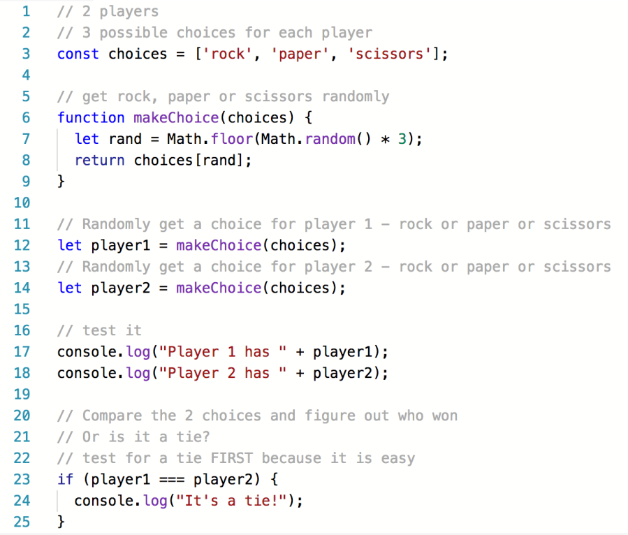
My example: The problem to solve is getting JavaScript to play Rock, Paper, Scissors. By writing out the “ingredients” we need to work with in this problem, and how those ingredients interact with one another, we start to get a grip on what needs to be done:

Screen Shot 2018-10-16 at 12.02.09 PM

Notice how I did not use any JavaScript terms, such as variable or let, if or else if, or arrays. Pseudo code is just plain, normal English.

Continuing with more pseudo code: I am not finished yet. Now I have to reason out the things the program must do. Again, I will use just plain English to do this.

Screen Shot 2018-10-16 at 12.06.01 PM

I might have everything I need now. I will think about the game and how we play it with two people, using their hands in the normal way. Maybe I want to offer “best out of three.” If I do that, I will also need to keep score. That’s more work, more code. If I decide to do that, I will add it to my pseudo code.

Starting to write real JavaScript: We can copy the pseudo code into a file as JavaScript comments, and then write the real code directly into those comments. Here’s a live example to show what I mean.

My example isn’t finished — it doesn’t completely play Rock, Paper, Scissors yet. It does run without errors, though, and that’s another important point: We can use the pseudo code comments to write one little bit of the program at a time, test it, and after it works, move on to the next little bit.

Screen Shot 2018-10-16 at 12.22.38 PM

You can see that I moved my pseudo code around in the live example. I changed the order. That’s normal. As I figured out bit by bit how to solve each step that’s needed, I moved some of the pseudo code lower down, because I haven’t solved those parts yet.

Screen Shot 2018-10-16 at 12.27.09 PM.png

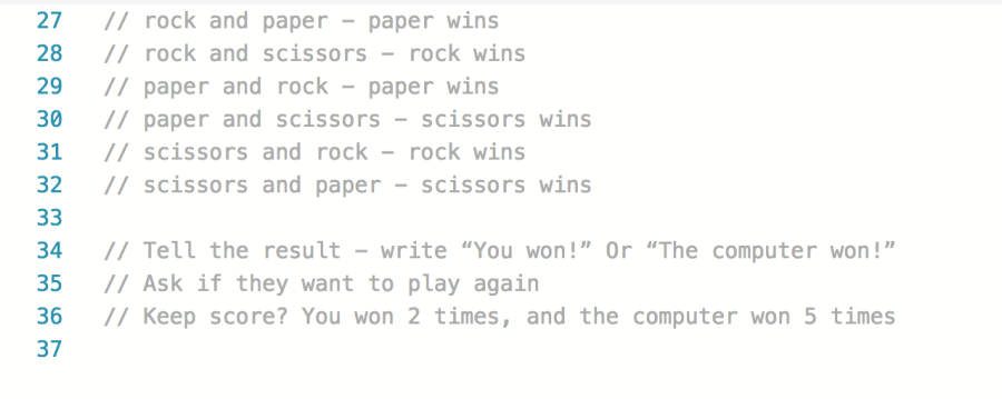
You can see that I have removed the original three lines of pseudo code about a tie. I did that because my JavaScript has already handled any kind of tie, in lines 23–25 above.

As I continue to solve this problem, to make the “game” actually work, I might continue moving and even rewriting my pseudo code. At the end, I might delete the pseudo code comment lines. But I might keep them, to remind me how I solved it all.

Using pseudo code is not only for beginners. Experienced pros use it too.

Image source: Public domain, from Publicdomainvectors.org

Starting JavaScript!

js

This week, you will start learning JavaScript, the programming language that lets us add interactivity and more to web pages and apps. This is a handy list of resources:

JavaScript has been around since 1995, and random Googling by a beginner is likely to end in tears. There are so many old tutorials and so much outdated advice! You most definitely can learn to use JavaScript, but keep your focus on what is taught in this course and what is asked of you in the assignments. I have tried to streamline it for you.

Note: If you use JSHint, make sure you click “Configure” at the top of the page and select “New JavaScript features (ES6).” Otherwise you will get an error every time you use the let keyword, or any template literal.

Screen Shot 2018-10-08 at 6.29.37 PM

CSS grid and CSS flexbox

This week we start to learn about CSS grid. Last week, we learned about CSS flex styles. There are certainly times when you will be puzzled about which of these two choices is the best one for a particular design problem you are facing.

A CSS grid layout has one huge difference from a CSS flex layout:

  1. When you choose grid, you want to arrange items in two directions, both rows and columns, inside a grid container.
  2. When you choose flex, you will work with only one row, OR one column, inside a flex container.

You will still scratch your head over this choice at times, so here are two wonderful, free resources that might help:

  • Grid by Example is a site with tons of examples of how to use grid layouts, with a handy visual arrangement that makes it easy to identify a pattern that might work for your design.
  • CSS Flexbox Examples includes a bunch of sample layouts for distinct situations, like a photo gallery.

Flex actually has far fewer options, because with flex we are only arranging one row of things, or one column of things. So check this out: A Complete Guide to Flexbox.

For fancy, artistic grid examples, see Web Design Experiments by Jen Simmons.

Colors for web apps!

Screen Shot 2018-09-17 at 12.01.39 PM.png

This article is full of amazing resources for choosing a palette for your web app. In addition to the subtle palette shown above, they show 19 more examples from “Sites of the Day” chosen by aWWWards.

And that’s not all! Below the 20 inspiring examples, the article links to a bunch of free online tools for choosing and combining colors. For example, 0 to 255 lets you enter one color and see a huge sample of lighter and darker shades of that color.

Screen Shot 2018-09-17 at 12.09.02 PM

If you’re having trouble wrapping your mind around hexadecimal codes for color, watch this 4-minute video:

Last but not least: When choosing text colors, always make sure they have enough contrast against your background color to make reading the text easy. If you have any doubt about it, you can check the level of contrast here to make sure it’s good enough.

CSS Grid resources

Ryan was kind enough to give us a demo of CSS Grid in class on Nov. 21. He recommended these resources for learning to use grid layouts:

.

Using a background image

In your final project, some of you may want to use images in ways that seem awkward at first. Maybe you have forgotten that an image can be used as a background for any container-type element in HTML: a div, an article, a section, etc.

Here’s an example of the same image (one image) used to “cover” the background of three different-sized divs, with the image centered in each case. This is done with CSS. Robbins explained this where she talked about the background property in CSS.

Notice how I wrote white text over top of the image using normal HTML <p> tags.

Here’s the code (HTML and CSS only) for that example.

You’ll notice that Codepen is a site similar to jsFiddle, only more beautiful. It’s a good place for searching for solutions to tricky CSS and Bootstrap problems you need to solve. Just make sure you link to the exact Pen you used if you copy any code from Codepen! You may also embed the URL to the Pen in your CSS or JavaScript as a comment.

Do not steal code and fail to give credit to where you found it. Always include a complete URL for any copied code so that you don’t break the plagiarism rules.